Drawing a brand: the mystery behind illustration
Hi I’m Eve, an illustrator and designer here at Attention Media. During my year at the company I have been fortunate to apply my illustration skills to many projects. Observing from photographs, and using a mixture of techniques on Adobe Illustrator, I create both simple and intricate illustrations for several of our clients.
I believe illustration adds a special something to a brand, in a way that typeface, photography and words alone cannot. This is because illustrated design results in a truly original piece of work. Every illustrator has a unique style and a unique palette of favoured colours – so for a brand, it’s about finding the right illustrator that represents them. A unique, distinctive illustration is a stamp of creativity, which instantly raises it far above any characterless system font or standard stock imagery.
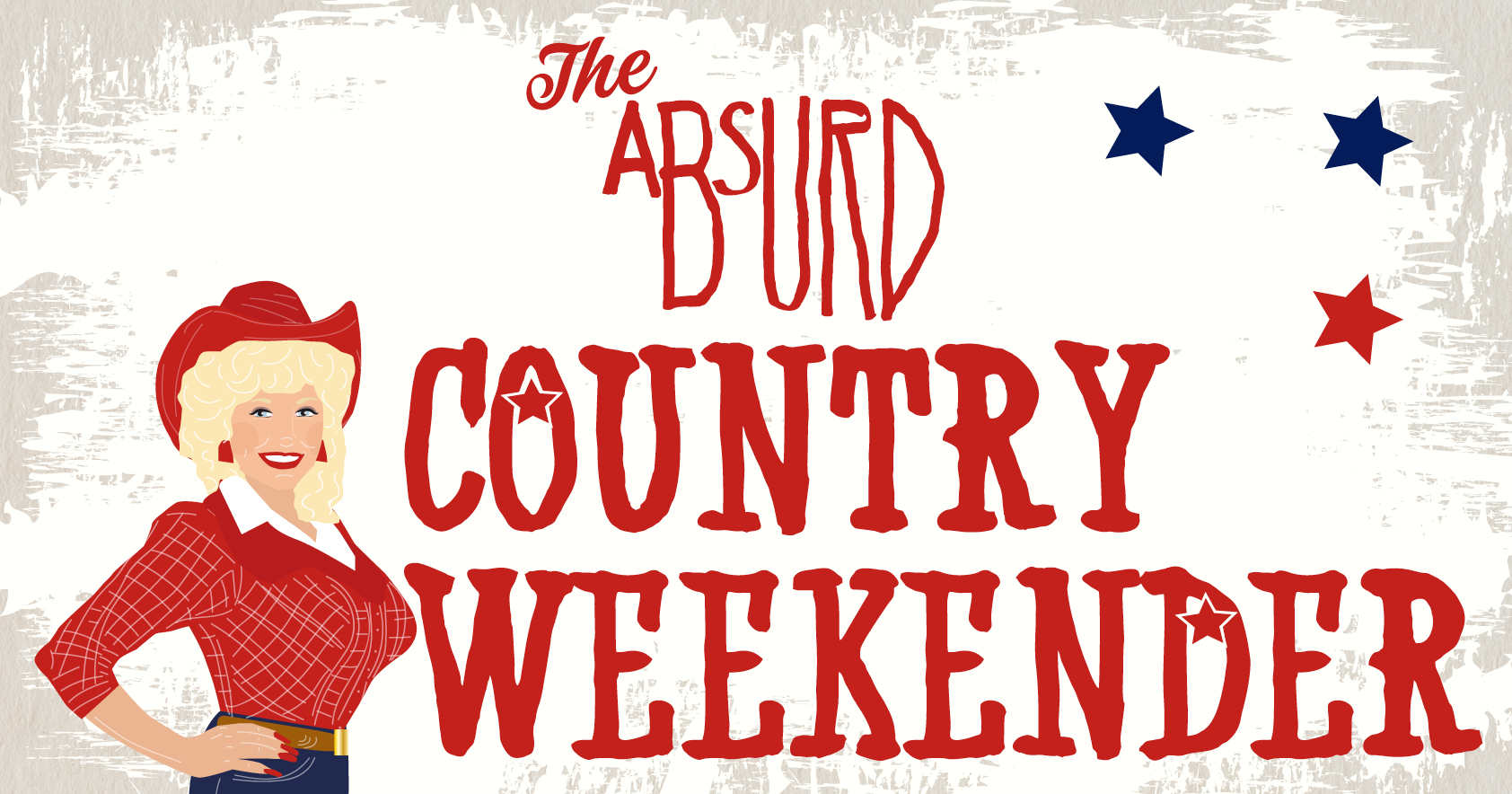
A regular client of ours – Absurd Bird – recently required a Country Weekender poster, and with the intention of adding a bit of originality to the design, I illustrated Dolly Parton and placed her next to the title text. Rather than just relying on type, the distinctive image of Dolly portrays the message of the country and western theme in an instant. Even more recently, the restaurant chain required simple illustrated icons of cocktail glasses to accompany their bar menu. This again, provides immediate communication with the consumer (which may be even more useful after their fifth cocktail!).


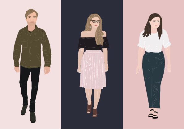
I have also illustrated the awesome team here at Attention Media, which appear across social media graphics, emails and our website.. The fun illustrations represent all of our unique qualities, and bring a more quirky, creative edge to our existing brand. This was displayed well when we were nominated in the Creative category at the Exeter Living awards, where the illustration was displayed on the giant screens!
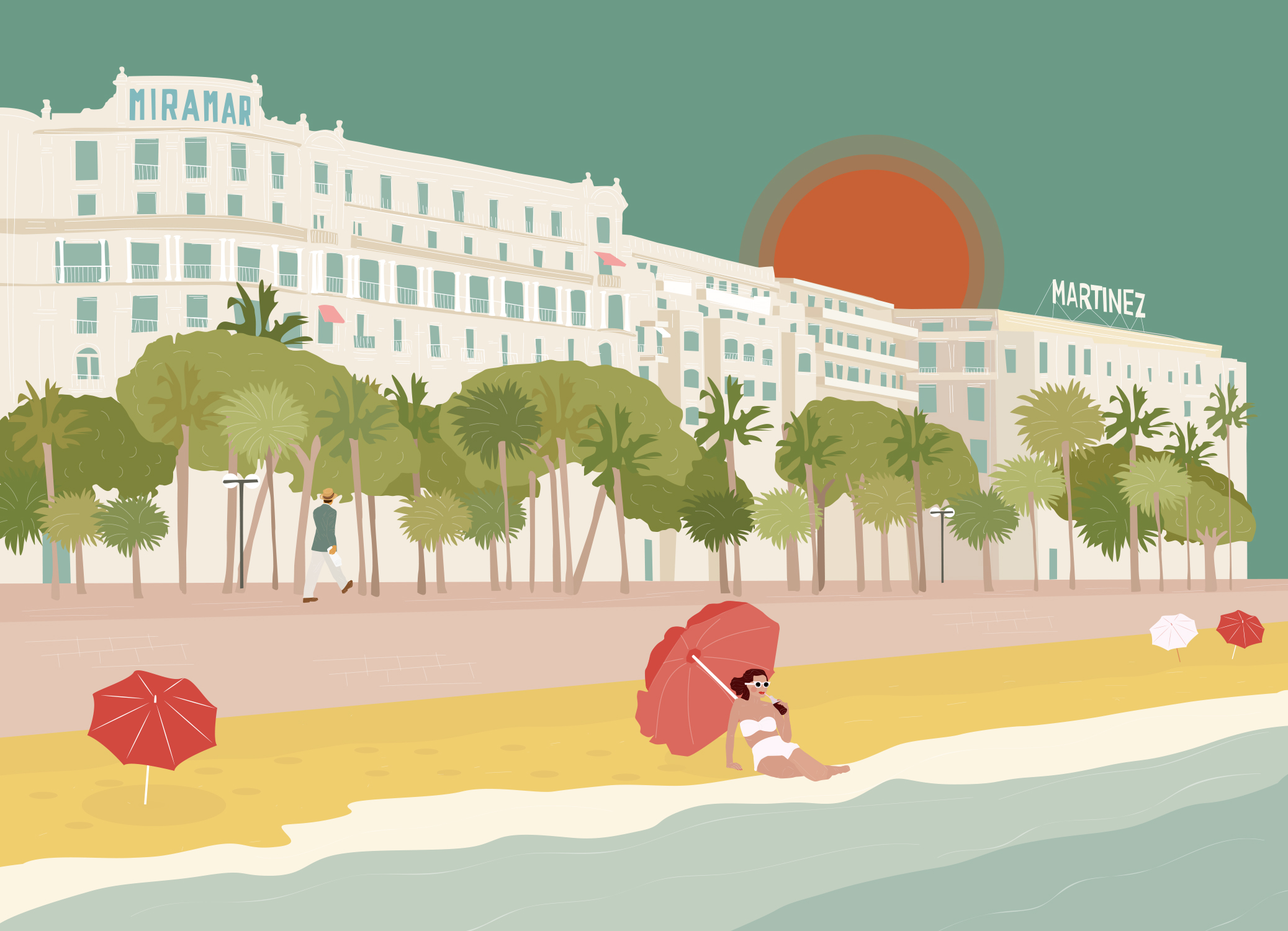
We also found a unique way of keeping in touch with the new contacts that we met at MIPIM, in Cannes, by posting them my illustrated retro-style postcards with a handwritten message from our MD, Sarah Jepson. This, again, shows an originality that is hard to re-create or copy.

Many other companies are using illustration to add individuality to their brands. Etsy use a hand drawn style of illustration which ties in really well with the handmade, independent artists that sell on the site. Ashley House printers use animal illustrations to promote various aspects of their business, such as their green printing ethos. One of my favourite graphic designers, Marta Veludo, was behind the Soda Make up brand, where each piece of makeup packaging has a cute illustration, resulting in a really fun, quirky and unique brand identity.
Simple icons can also be illustrated and used within brands to quickly and clearly clarify a message. Clothing brand Skinny Dip use icon style illustrations to highlight key customer information on their website.
![]()
We applied this technique for the infographic illustration used for our client Burrington Estates, where I illustrated an icon for each on of their housing schemes. These icons appear on their website and within certain flyers and posters to give the schemes a cohesive look and feel, while fitting the style of the brand.
I believe that illustration used within brands hints at a person behind the organisation, suggesting to the consumer that there’s a lot more to the product or service than just ‘buy me’. This is because illustration is more than just a sales tool, it’s a personable piece of art!